Create form
- 09 Sep 2024
- 4 Minutes to read
- Contributors

- Print
- DarkLight
- PDF
Create form
- Updated on 09 Sep 2024
- 4 Minutes to read
- Contributors
- Print
- DarkLight
- PDF
Article summary
Did you find this summary helpful?
Thank you for your feedback
To create a form:
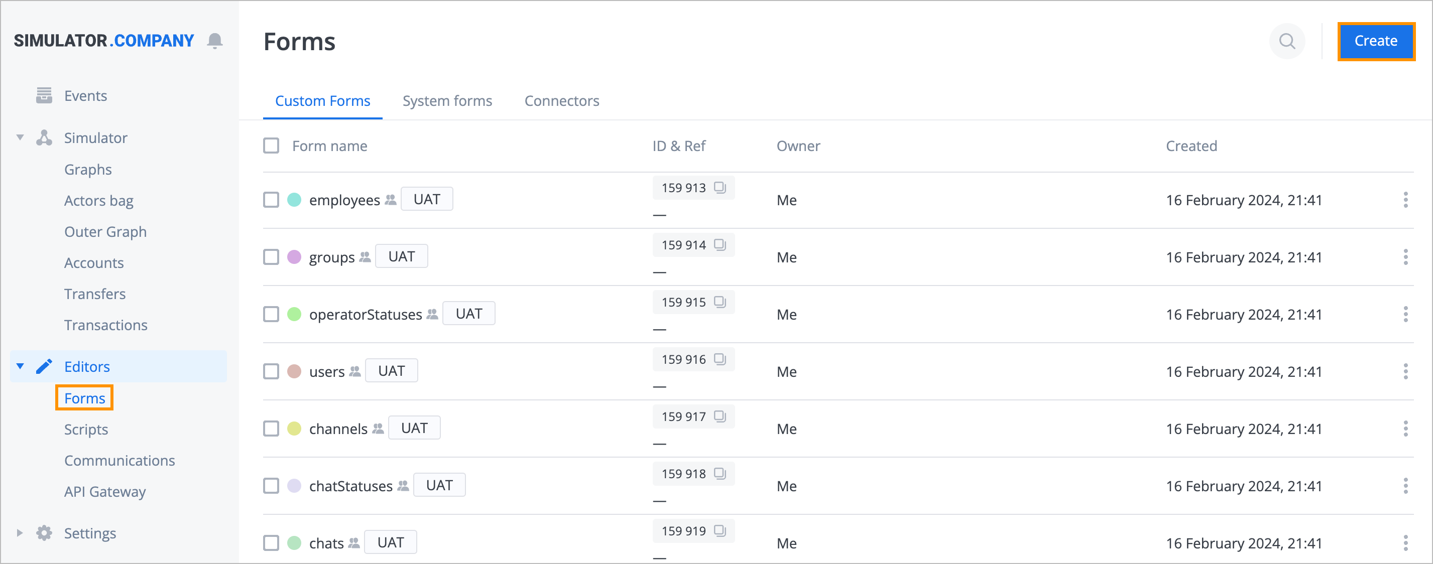
In the upper-right corner of the Forms page, click Create.
In the new form dialog:
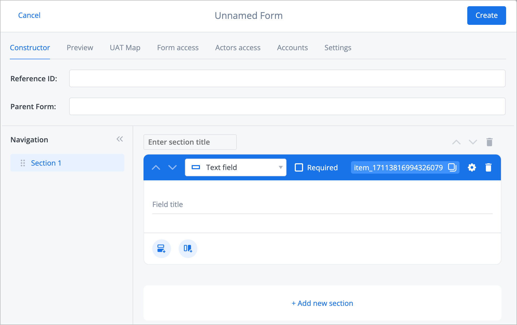
On the Constructor tab:
Enter the form reference ID in the Reference ID field.
Enter the parent form in the Parent Form field.
Edit the form field list in the Navigation list.
Enter the section title in the Enter section title field.
Select the needed field type in the dropdown list (Checkbox, Multiple choice, Dropdown, Multiselect, Text field, Text paragraph, Link, Button, Image, File upload, Calendar) and (optional) select the Required checkbox.
Fill in the field below the type field according to the selected type (step v).
Note: For more information on each type, go to Field types.(Optional) Click the copy icon to copy the form ID.
(Optional) Click the settings icon and fill in or edit the main settings fields.
Note: For more information on settings, go to Main settings.(Optional) Click the horizontal or vertical plus icon to add a field below correspondingly or on the right side.
(Optional) Click + Add new section and fill in the needed fields (steps iv-ix)
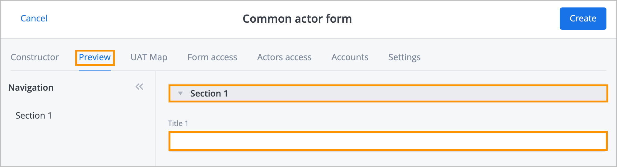
(Optional) On the Preview tab:
- View and edit titles of the form’s sections (if there are any).
- Fill out the fields of the form’s sections.
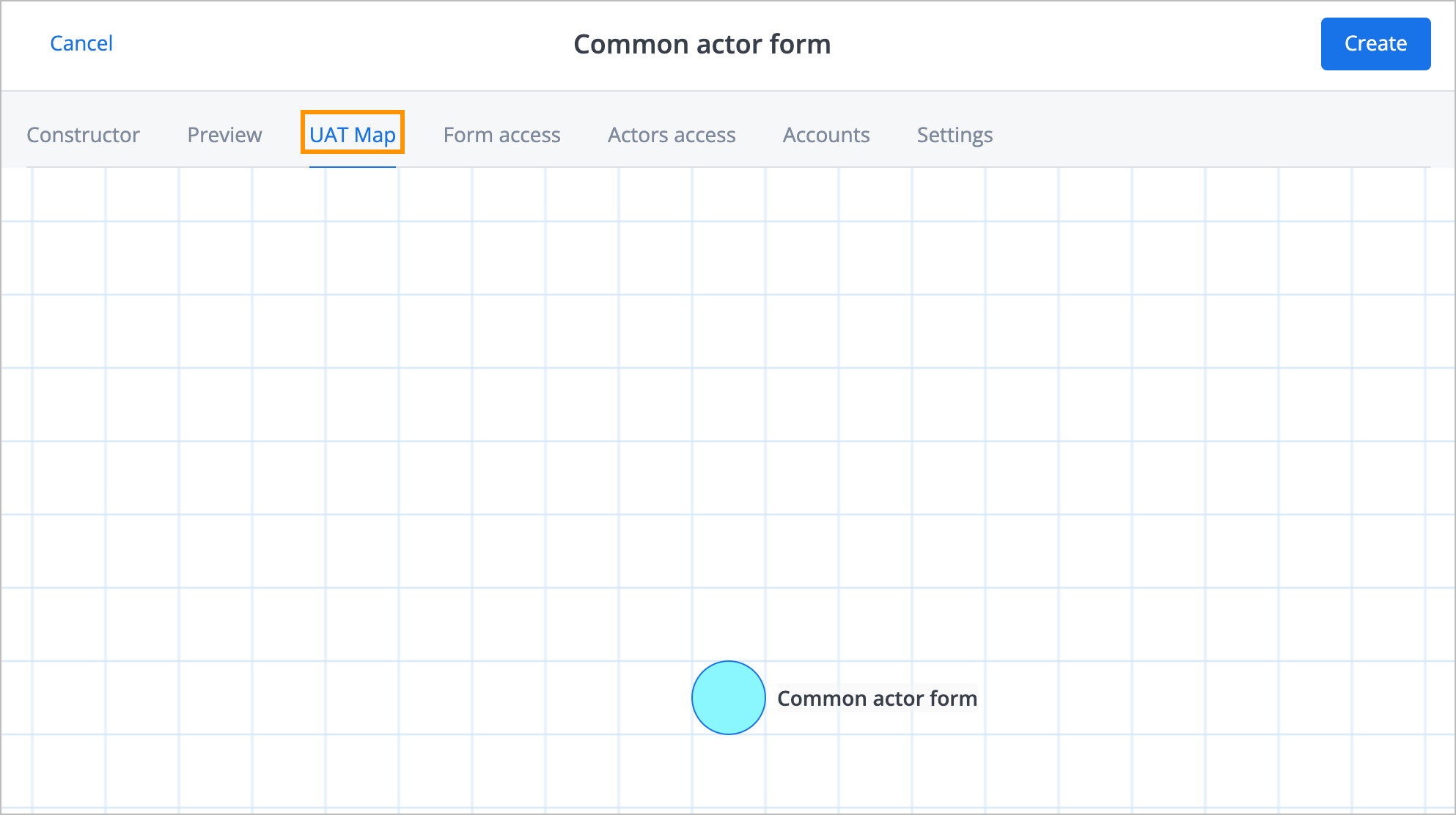
(Optional) On the UAT Map tab:
- View the form’s hierarchy: current form’s parent and child forms (if there are any) on the graph layer.
- Move the current form and its child and parent actors across the graph layer.
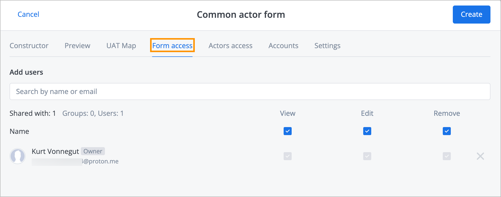
(Optional) On the Form access tab, share the form with other users:
- Enter the needed user’s name or email in the Add users field and click Add.
- Select the needed permission checkboxes (View, Edit, and Remove) and click Create.
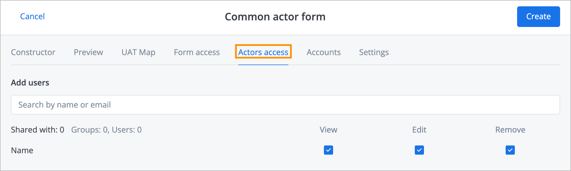
(Optional) On the Actors access tab, share the actors with other users:
- Enter the needed user’s name or email in the Add users field and click Add.
- Select the needed permission checkboxes (View, Edit, and Remove) and click Create.
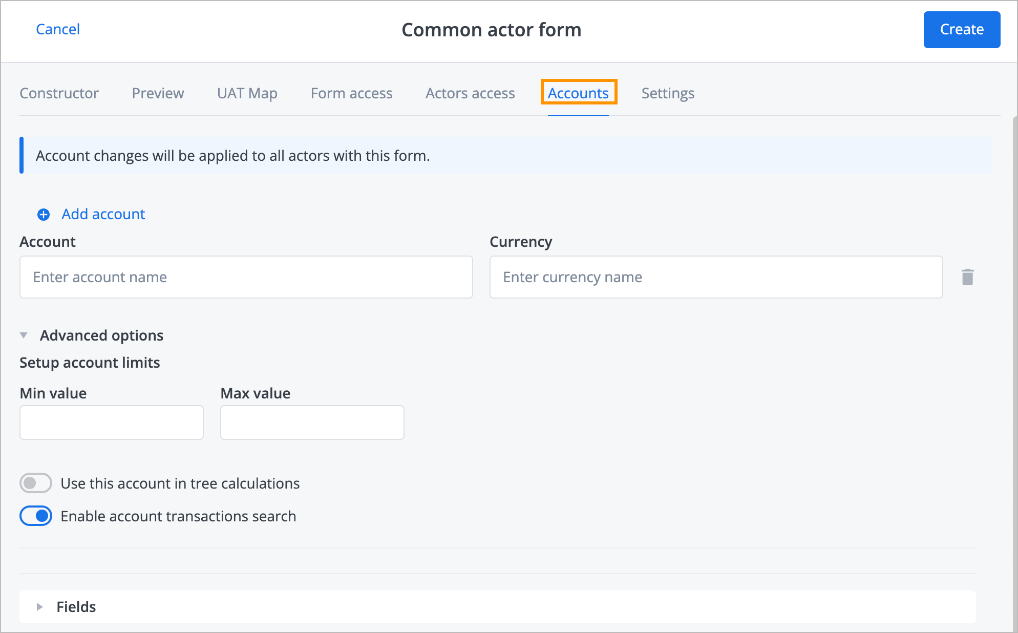
(Optional) On the Accounts tab:
- View the form accounts.
- Add an account to the form by clicking Add account.
- Select the name of the account you want to add in the Account field and the currency in the Currency field.
- In Advanced options, correspondingly specify the minimum and maximum values for the account balance in the Min value and Max value fields.
- Turn the Use this account in tree calculations toggle on or off.
- Turn the Enable the account transactions search toggle on or off.
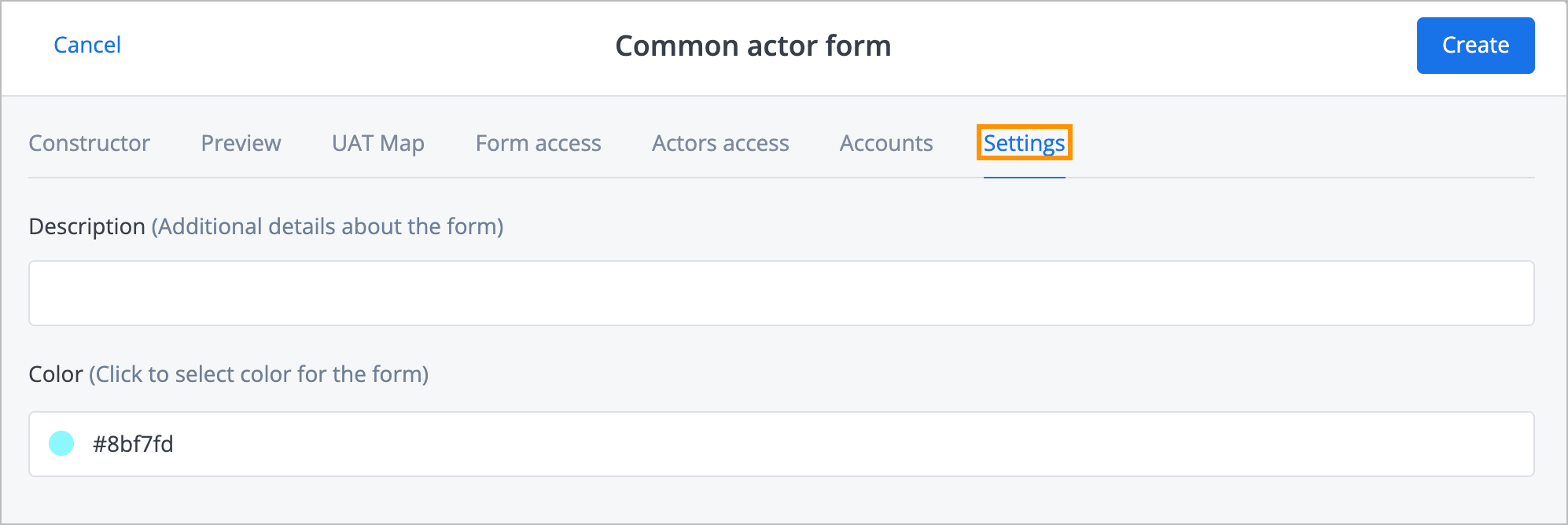
(Optional) On the Settings tab:
- Enter additional details about the form in the Description field.
- Click the Color field and select the form color.
In the upper-right corner, click Create.


The form has been created, and you can see it in the form list on the Forms page.
Field types
On the Constructor tab of the new form dialog, you have different field types to select:
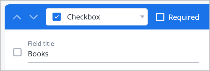
Checkbox: Enter the checkbox name in the Field title field.
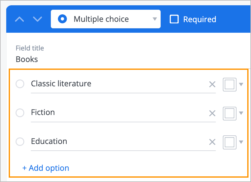
Multiple choice: Enter options to select and set the color by clicking the white box dropdown list.
Note: To add an option, click + Add option.
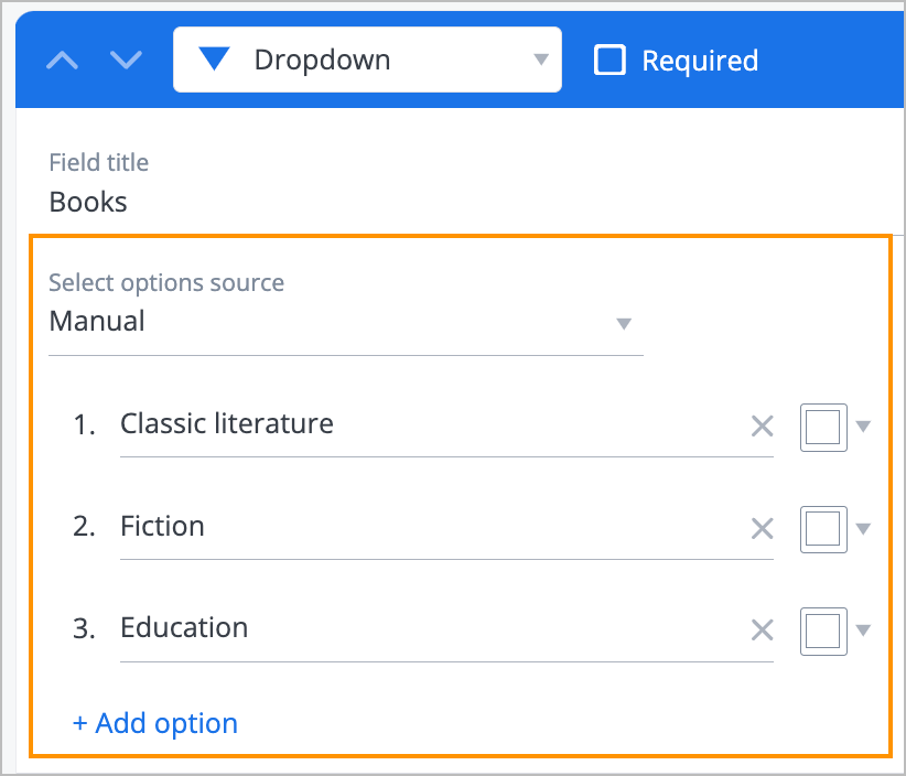
Dropdown, Multiselect: Select the options source (Manual, Graph Layer, Actor filter, Separate actors, Currencies, Account names, Workspace members, API, or Corezoid Sync API), enter options to select, and set the color by clicking the white box dropdown list.
Note: To add an option, click + Add option.
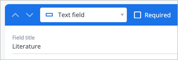
Text field: Enter a text title in the Field title field.
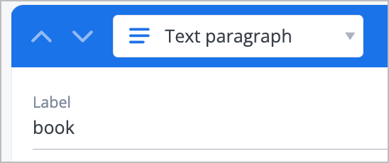
Text paragraph: Enter a label in the Label field.
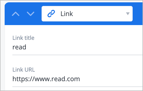
Link: Enter a link title and a link URL in the Link title and Link URL fields correspondingly.
Button: Enter a button name in the Field title field.
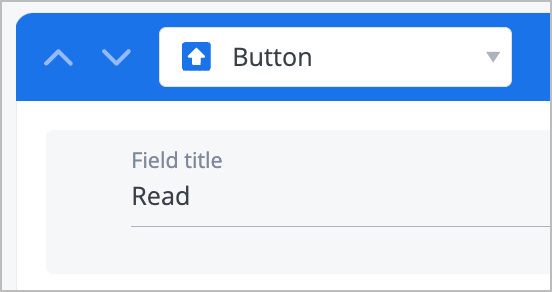
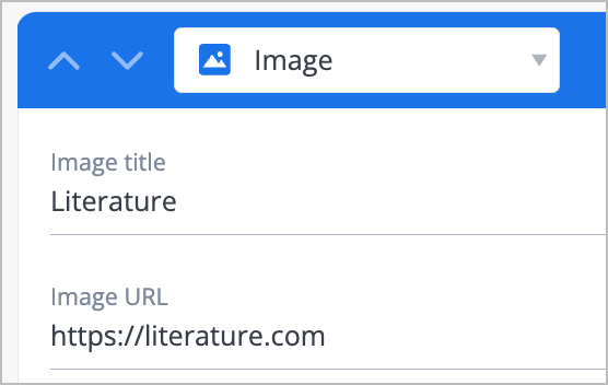
Image: Enter an image title and an image URL in the Image title and Image URL fields correspondingly.
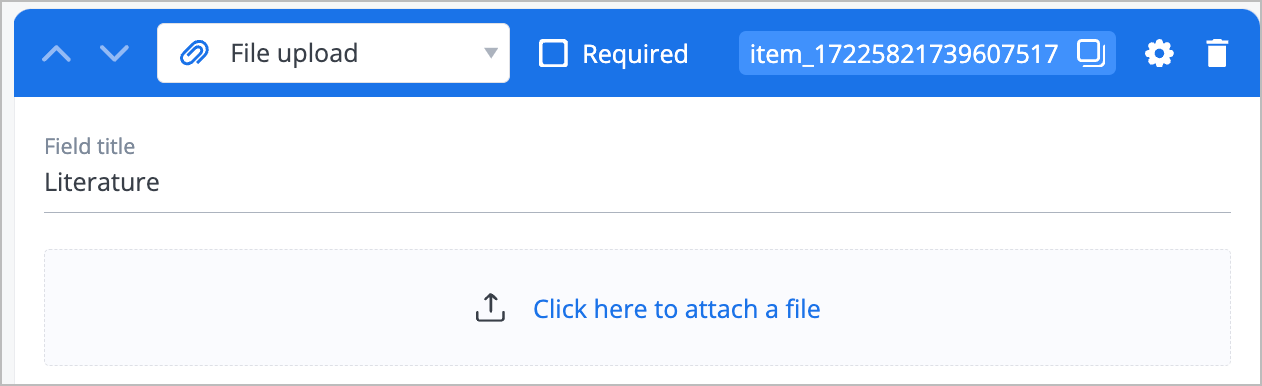
File upload: Enter a file name in the Field title field and upload a file by clicking Click here to attach a file.
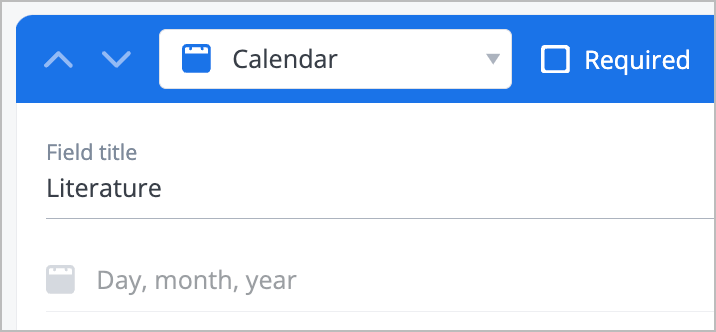
Calendar: Enter a calendar name in the Field title field and select a day, a month, and a year in the Day, month, year calendar.


Main settings
Editing the fields in the Main settings is optional.
On the Constructor tab of the new form dialog, click the settings icon to configure the main settings.

According to the previously selected form field type, you can fill in or edit the following fields:
- ID: Edit the field ID.
- Title: Enter a section title
- Type: Select the field subtype (Text, Password, Email, Phone, or Integer).
Note: Available for the Text field type only. - Visibility: Select whether the field is visible (Visible or Disabled).
- Align: Select the text alignment method (Left, Right, or Center).
Note: Available for the Image field type only. - Required: Select whether the field is required (Yes or No).
- Regular expression: Enter a regular expression.
Note: Available for the Text field type only. - Error message: Enter an error message.
- Default value: Enter a default value.
Note: Available for all field types except Button and File upload. - Multiline text: Select the checkbox and specify the number of rows below.
Note: Available for the Text field type only. - Value, Title, Color: Enter a value and title and select a color for each answer option.
Note: Available for the Multiple choice, Dropdown, Multiselect fields types only. - Maximum width, Maximum height: Enter the maximum width and height of the field image.
Note: Available for the Image field type only. - Text in upload area: Enter a text to display in the upload area.
Note: Available for the File upload field type only. - Accept types: Enter file types to be accepted for the upload.
Note: Available for the File upload field type only. - Upload multiple files: Select the checkbox to enable multiple files upload.
Note: Available for the File upload field type only. - Minimum date, Maximum date: Select the minimum and maximum dates.
Note: Available for the Calendar field type only. - Enable time selection, Enable time zone selection, Enable date range selection: Select the checkboxes to enable selections.
Note: Available for the Calendar field type only.
Was this article helpful?